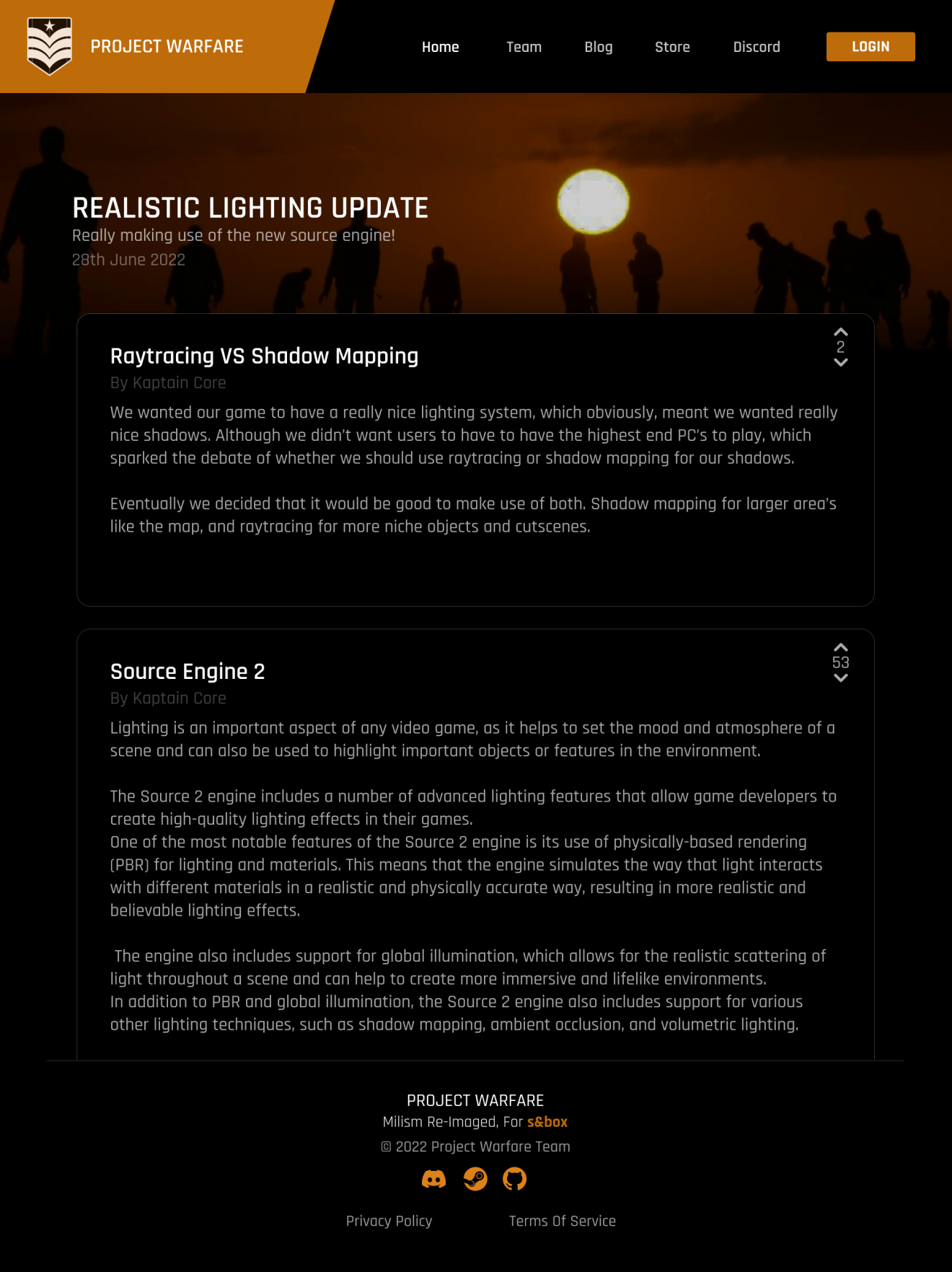
Project Warfare is a site I designed and built the front-end for. It was built for a small s&box community to promote one of their projects.
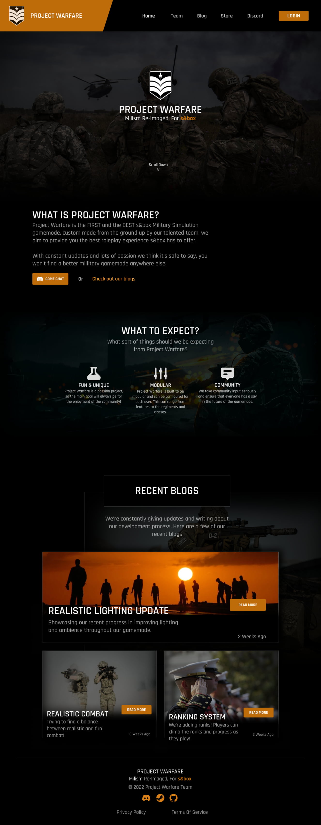
The index page is the main focus. The client sent me their previous site design, said they wanted something ‘dark and bold’. and I took creative liberty from there.
This was my first real introduction to TailwindCSS, which I have to say has changed my life (in the least dramatic way possible).
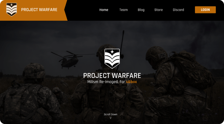

They had two main goals with their index page:
They wanted to inform potential players of the projects features and they wanted to get people to join their discord.
I pushed the former by making use of development blogs as a nice way for the client to showcase their progress, and the latter through multiple CTA buttons.

After selecting a blog, you’d be brought to this page.
The client wanted blogs to be simple, only requesting for an upvote/downvote feature, to be able to showcase images and format their text.
We implemented a WYSIWYG editor and settled with this. Whilst it’s not your regular blog, it fit the site theme nicely and does everything the client wanted!
